
What Is a Bento Grid and Why Is It Everywhere?
If you’ve visited Apple’s product pages, Windows 11’s feature showcases, or almost any modern SaaS landing page in the past two years, you’ve already seen a bento grid in action — even if you didn’t know the name.
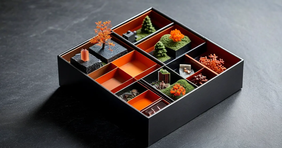
A bento grid is a modular layout technique inspired by the traditional Japanese bento box: a single container divided into neat, asymmetric compartments, each holding a different item. Translated into web design, it means a grid of tiles with varying sizes and proportions that together form a cohesive, visually striking section.
Unlike a classic uniform card grid where every element is the same size, a bento grid deliberately plays with scale, hierarchy, and white space. A hero tile might span two columns and two rows, while smaller tiles occupy single cells. The result is a layout that feels both organized and dynamic — structured enough to guide the eye, but varied enough to keep attention.
The trend exploded in 2022–2023 after Apple used it prominently for the iPhone 14 and MacBook feature breakdowns. Since then, companies like Linear, Vercel, Raycast, and Stripe have embraced the pattern. According to a 2024 analysis by Awwwards, over 38% of nominated sites now feature some form of bento-style layout on their homepage.
But a bento grid isn’t just a trend. It’s a genuinely effective way to present complex information — product features, service offerings, dashboards, portfolios — without overwhelming the user. Let’s break down exactly how it works, how to build one, and when to use it.
The Anatomy of a Bento Grid Layout
Core Characteristics
Every well-designed bento grid shares a few fundamental traits:
- Asymmetric tile sizes — Tiles vary in width and height, creating visual hierarchy.
- Consistent gutters — The spacing between tiles is uniform, typically 12px to 24px.
- Rounded corners — Almost all modern bento grids use border-radius, usually between 12px and 24px.
- Contained content — Each tile is self-sufficient; it communicates one idea, one feature, one metric.
- Subtle backgrounds — Tiles often use soft gradients, muted colors, or glassmorphism to differentiate sections without visual noise.
Typical Grid Structure
Most bento grids are built on a 4-column base for desktop, collapsing to 2 columns on tablet and 1 column on mobile. Here’s how a common 6-tile bento section might be structured:
| Tile | Desktop Size | Content Type | Purpose |
|---|---|---|---|
| A | 2 cols × 2 rows | Hero image or animation | Primary attention anchor |
| B | 2 cols × 1 row | Feature headline + icon | Key selling point |
| C | 1 col × 1 row | Statistic or metric | Social proof or data |
| D | 1 col × 1 row | Small illustration | Visual variety |
| E | 1 col × 2 rows | Testimonial or quote | Trust building |
| F | 3 cols × 1 row | CTA or feature summary | Conversion driver |
This asymmetry is what makes the bento grid so effective. The large tile (A) immediately draws the eye, creating an entry point. From there, the viewer naturally scans smaller tiles, absorbing secondary information in digestible chunks.
Why Bento Grids Work: The UX and Psychology Behind the Pattern
Bento grids aren’t popular just because they look good. There are concrete UX principles at play:
1. Chunking Reduces Cognitive Load
Miller’s Law suggests that people can hold about 7 ± 2 items in working memory at once. A bento grid naturally chunks information into discrete, bordered sections, making it far easier to process than a long-scrolling page of paragraphs.
2. Visual Hierarchy Guides Scanning
Nielsen Norman Group’s research shows that users scan pages in F-patterns or Z-patterns. A well-designed bento grid leverages size contrast to create clear focal points that align with these natural scanning behaviors. The big tile gets seen first. Always.
3. Engagement Metrics Improve
Several case studies from design agencies — including work our team at Lueur Externe has conducted for e-commerce and SaaS clients — show that bento-style feature sections can increase time on page by 15–20% and click-through rates on embedded CTAs by 10–12% compared to traditional stacked layouts.
The reason is simple: bento grids invite exploration. Each tile feels like a small discovery, encouraging users to interact with content they might otherwise scroll past.
Building a Bento Grid with CSS Grid: A Practical Guide
The backbone of any bento grid is CSS Grid Layout. Flexbox can handle simple cases, but CSS Grid gives you the two-dimensional control you need for proper bento layouts.
Basic HTML Structure
Here’s a clean, semantic starting point:
<section class="bento-grid" aria-label="Product Features">
  <div class="bento-tile bento-tile--hero">
    <h3>Lightning-Fast Performance</h3>
    <p>Built on edge infrastructure for sub-100ms responses.</p>
  </div>
  <div class="bento-tile bento-tile--feature">
    <h3>99.9% Uptime</h3>
  </div>
  <div class="bento-tile bento-tile--stat">
    <span class="stat-number">2.4M+</span>
    <span class="stat-label">Requests per day</span>
  </div>
  <div class="bento-tile bento-tile--visual">
    <img src="/img/feature-illustration.svg" alt="API integration diagram" />
  </div>
  <div class="bento-tile bento-tile--testimonial">
    <blockquote>"The migration was seamless."</blockquote>
    <cite>— CTO, Acme Corp</cite>
  </div>
  <div class="bento-tile bento-tile--cta">
    <h3>Ready to start?</h3>
    <a href="/signup" class="btn">Get Started Free</a>
  </div>
</section>
The CSS
.bento-grid {
  display: grid;
  grid-template-columns: repeat(4, 1fr);
  grid-auto-rows: 180px;
  gap: 16px;
  max-width: 1200px;
  margin: 0 auto;
  padding: 2rem;
}

.bento-tile {
  background: #f5f5f7;
  border-radius: 20px;
  padding: 2rem;
  display: flex;
  flex-direction: column;
  justify-content: center;
  overflow: hidden;
  transition: transform 0.3s ease, box-shadow 0.3s ease;
}

.bento-tile:hover {
  transform: translateY(-4px);
  box-shadow: 0 12px 40px rgba(0, 0, 0, 0.08);
}

/* Hero tile: spans 2 columns and 2 rows */
.bento-tile--hero {
  grid-column: span 2;
  grid-row: span 2;
  background: linear-gradient(135deg, #667eea 0%, #764ba2 100%);
  color: white;
}

/* Feature tile: spans 2 columns */
.bento-tile--feature {
  grid-column: span 2;
}

/* Testimonial tile: spans 1 column, 2 rows */
.bento-tile--testimonial {
  grid-row: span 2;
}

/* CTA tile: spans 3 columns */
.bento-tile--cta {
  grid-column: span 3;
  background: #1a1a1a;
  color: white;
  text-align: center;
}

/* Responsive: 2 columns on tablet */
@media (max-width: 768px) {
  .bento-grid {
    grid-template-columns: repeat(2, 1fr);
    grid-auto-rows: 150px;
  }
  .bento-tile--hero {
    grid-column: span 2;
    grid-row: span 2;
  }
  .bento-tile--cta {
    grid-column: span 2;
  }
}

/* Responsive: single column on mobile */
@media (max-width: 480px) {
  .bento-grid {
    grid-template-columns: 1fr;
    grid-auto-rows: auto;
  }
  .bento-tile--hero,
  .bento-tile--feature,
  .bento-tile--cta {
    grid-column: span 1;
  }
}
This code gives you a fully responsive bento grid that gracefully adapts across screen sizes. The grid-column: span and grid-row: span properties are the key — they let individual tiles break out of the uniform grid to create that distinctive asymmetric look.
Using grid-template-areas for More Control
For complex layouts where you need precise tile placement, grid-template-areas offers a visual way to define your grid:
.bento-grid--precise {
  display: grid;
  grid-template-columns: repeat(4, 1fr);
  grid-template-rows: repeat(3, 180px);
  grid-template-areas:
    "hero   hero   feat   feat"
    "hero   hero   stat   visual"
    "testi  cta    cta    cta";
  gap: 16px;
}

.bento-tile--hero        { grid-area: hero; }
.bento-tile--feature     { grid-area: feat; }
.bento-tile--stat        { grid-area: stat; }
.bento-tile--visual      { grid-area: visual; }
.bento-tile--testimonial { grid-area: testi; }
.bento-tile--cta         { grid-area: cta; }
This approach is particularly useful when designers hand off a pixel-perfect mockup in Figma or Sketch. You can map the named areas directly to the visual layout.
Bento Grid vs. Traditional Layouts: A Comparison
When should you use a bento grid instead of a standard layout? Here’s a quick decision framework:
| Criteria | Bento Grid | Uniform Card Grid | Single-Column Stack |
|---|---|---|---|
| Visual impact | ★★★★★ | ★★★ | ★★ |
| Content hierarchy | Strong — size drives importance | Weak — all items equal | Moderate — order drives importance |
| Best for | Feature showcases, dashboards, portfolios | Product listings, blog archives | Long-form content, articles |
| Complexity to build | Medium | Low | Very low |
| Responsive behavior | Requires careful planning | Naturally responsive | Inherently responsive |
| Content amount | 4–12 items ideal | Unlimited | Unlimited |
| User engagement | High (novelty + scanability) | Moderate | Lower for non-readers |
The takeaway: bento grids shine when you have 4–12 discrete pieces of information that vary in importance. If all items are equal (like a product catalog), stick with a uniform grid. If you’re writing long-form content, stick with a single column.
Real-World Bento Grid Examples and What Makes Them Work
Apple
Apple’s product feature pages (iPhone, MacBook, Apple Watch) are the gold standard. Their bento tiles combine micro-animations, product photography, and minimal text to create a premium feel. Key lesson: let visuals do the heavy lifting inside each tile.
Linear
Linear’s homepage uses a bento grid to showcase product features like issue tracking, cycles, and roadmaps. Each tile contains a small interactive demo or animation that activates on hover. Key lesson: make tiles interactive to boost engagement.
Stripe
Stripe uses bento-style sections to explain complex financial infrastructure concepts. They pair code snippets with visual outputs in adjacent tiles. Key lesson: bento grids are excellent for showing cause-and-effect or input-output relationships.
Vercel
Vercel’s developer experience page uses a dark-themed bento grid with terminal-style tiles alongside metric tiles showing deployment speeds. Key lesson: match your tile styling to your brand’s personality.
Accessibility and Performance: Don’t Sacrifice Function for Form
A beautiful bento grid that isn’t accessible or fast is a failure. Here are non-negotiable best practices:
Accessibility Checklist
- Semantic HTML: Use proper headings (
h3,h4) inside tiles, not just styleddivelements. - ARIA labels: Add
aria-labelto the grid section and meaningful labels to interactive tiles. - Keyboard navigation: Ensure all clickable tiles are focusable and have visible focus indicators.
- Color contrast: Meet WCAG 2.1 AA standards — at minimum 4.5:1 contrast ratio for text.
- Reduced motion: Wrap hover animations in a
prefers-reduced-motionmedia query.
@media (prefers-reduced-motion: reduce) {
  .bento-tile {
    transition: none;
  }
  .bento-tile:hover {
    transform: none;
  }
}
Performance Tips
- Lazy-load images inside tiles that are below the fold.
- Use
<picture>with WebP/AVIF for tile background images. - Avoid heavy JavaScript animations — CSS transitions and animations are almost always sufficient and far more performant.
- Set explicit dimensions on grid rows to prevent Cumulative Layout Shift (CLS).
At Lueur Externe, our development team runs Lighthouse audits on every bento grid implementation to ensure performance scores stay above 90 on mobile. A grid that scores 50 on Core Web Vitals is a grid that hurts your rankings, no matter how good it looks.
Designing Bento Grids in Figma: Tips for Designers
If you’re a designer preparing a bento grid for development handoff, keep these principles in mind:
- Use Figma’s Auto Layout and Grid features to build your bento grid with real constraints, not just freehand rectangles.
- Define a base unit — for example, a 280px × 180px single tile — and make all larger tiles exact multiples of that unit plus the gap.
- Name your layers consistently (e.g.,
tile-hero,tile-stat,tile-cta) so developers can map them to CSS grid areas. - Design the mobile breakpoint first. If your bento layout doesn’t collapse gracefully to a single column, it’s not ready for production.
- Limit your tile count. 6–9 tiles is the sweet spot. More than 12 tiles and the layout starts to feel like a cluttered dashboard rather than a curated showcase.
Common Bento Grid Mistakes to Avoid
Even experienced teams get bento grids wrong. Here are the pitfalls we see most often:
- Too many tiles of the same size — This defeats the purpose. If everything is the same size, it’s just a card grid. You need at least 2–3 size variations.
- No clear visual hierarchy — The largest tile should contain your most important message. Don’t waste it on a decorative illustration.
- Inconsistent padding and gutters — Even a 4px difference between tile padding and grid gap creates a subconscious feeling of messiness.
- Ignoring mobile — A 4-column bento grid that becomes a 1-column stack of identically-sized blocks loses all its visual appeal. Consider reordering tiles or adjusting proportions for mobile.
- Overloading tiles with content — Each tile should communicate one idea. If you need a paragraph of text, the tile is probably too small or the content should live elsewhere.
- Purely decorative tiles — Every tile should serve a purpose: inform, persuade, or direct. A tile that’s just a gradient swatch is wasted space.
The Future of Bento Grids: What’s Coming in 2025 and Beyond
The bento grid pattern is evolving. Here are trends we’re tracking:
- CSS Subgrid (now supported in all major browsers as of late 2024) will make it easier to align content within tiles to the outer grid, creating even more polished layouts.
- View Transitions API will enable smooth animated transitions between bento grid states — imagine tiles rearranging when a user filters content.
- AI-generated layouts — Tools like Figma AI and emerging design agents will suggest optimal bento grid arrangements based on content type and quantity.
- 3D tiles — With WebGPU gaining browser support, expect to see bento tiles with real-time 3D scenes embedded inside, especially for product showcases.
The bento grid is not a passing fad. It’s a layout philosophy that aligns with how users consume information on the modern web: in focused, visual, bite-sized chunks.
Conclusion: Build Better Interfaces with Bento Grids
The bento grid represents a genuine evolution in how we structure web content. It takes the best aspects of grid-based design — order, alignment, predictability — and adds the visual energy of asymmetric layouts. When done right, it:
- Increases user engagement and time on page
- Creates clear visual hierarchy without overwhelming users
- Adapts beautifully to responsive breakpoints
- Makes complex feature sets feel simple and approachable
Whether you’re redesigning a SaaS homepage, building a portfolio, or revamping an e-commerce feature section, the bento grid is a layout pattern worth mastering.
At Lueur Externe, we’ve been helping businesses build high-performance, beautifully designed websites since 2003. From custom PrestaShop stores to WordPress platforms and cutting-edge front-end development, our team in the Alpes-Maritimes brings deep expertise in turning modern design patterns like bento grids into conversion-driving realities. If you’re ready to transform your web presence with a modular, engaging layout that performs as well as it looks, get in touch with our team today. Let’s build something remarkable together.