What Is Art Direction and Why Does It Matter?
Art direction is the practice of leading and unifying the visual language of a creative project—be it a marketing campaign, a website, a product launch, or a full rebrand. It is not simply about making things “look nice.” It is about making deliberate visual choices that serve a strategic purpose.
At its core, art direction answers a deceptively simple question: How should this campaign look and feel so that the audience understands exactly what we want them to understand?
Consider two competing coffee brands. Both sell premium beans. One uses earthy tones, hand-drawn illustrations, and rustic textures. The other uses stark black-and-white photography, minimalist typography, and generous white space. Neither approach is inherently better—but each communicates a completely different brand personality. That deliberate choice is art direction at work.
According to a 2023 Lucidpress study, consistent brand presentation across all platforms increases revenue by up to 23%. Art direction is the discipline that makes that consistency possible.
Art Direction vs. Graphic Design vs. Creative Direction
These three roles are often confused, sometimes even used interchangeably. They shouldn’t be. Each occupies a distinct place in the creative hierarchy.
| Role | Focus | Scope | Deliverable |
|---|---|---|---|
| Creative Director | Overall campaign strategy and messaging | Brand-wide, multi-channel | Creative brief, strategic vision |
| Art Director | Visual identity and aesthetic coherence | Campaign or project-specific | Mood boards, style guides, visual systems |
| Graphic Designer | Execution of individual assets | Asset-level | Layouts, banners, social posts, print files |
Think of it as a chain of command:
- The Creative Director says: “We need to position this brand as adventurous and youthful.”
- The Art Director says: “We’ll use bold saturated colors, dynamic angles, and action-oriented photography.”
- The Graphic Designer says: “Here’s the Instagram carousel, the landing page hero, and the billboard layout built to those specifications.”
Each role is essential. But art direction is the bridge between strategy and execution—the layer where abstract ideas become tangible visual systems.
The Art Direction Workflow: From Brief to Final Delivery
A well-structured art direction process saves time, reduces costly revisions, and produces stronger results. Here is the workflow that agencies like Lueur Externe follow when leading the visual creation of a campaign.
Step 1: Understand the Brief
Everything starts with the brief. A good art director doesn’t just read it—they interrogate it. Key questions include:
- Who is the target audience?
- What is the single most important message?
- What emotional response should the visuals trigger?
- What are the brand’s existing visual guidelines?
- What channels will the campaign run on?
- What is the budget and timeline?
Skipping this step—or treating it superficially—is the number one cause of creative misalignment.
Step 2: Research and Competitive Analysis
Before putting pen to paper (or cursor to screen), the art director studies the landscape. This means:
- Competitive audit: What do competitors’ campaigns look like? Where is there visual saturation, and where is there an opportunity to stand out?
- Trend analysis: What current design trends are relevant—and which ones should be deliberately avoided to maintain originality?
- Audience insights: What visual languages resonate with the target demographic? A Gen Z audience on TikTok responds to different aesthetics than a C-suite audience on LinkedIn.
Step 3: Develop the Visual Concept
This is the heart of art direction. The art director develops a visual concept—a cohesive system of design choices that will govern every asset in the campaign.
A visual concept typically includes:
- Color palette: Primary, secondary, and accent colors with exact hex codes
- Typography system: Headline, body, and accent typefaces with hierarchy rules
- Photography or illustration style: Realistic vs. stylized, studio vs. environmental, human-centric vs. product-centric
- Composition principles: Grid systems, use of negative space, focal point placement
- Texture and material cues: Glossy vs. matte, digital vs. organic, flat vs. dimensional
- Motion language (for video/animation): Pacing, transition style, kinetic typography rules
Here is an example of how a visual concept might be documented in a simple style token format that a design team can reference:
# Campaign Visual Concept: "Horizon" – Summer 2025

palette:
  primary: "#0A2463"      # Deep navy
  secondary: "#FB3640"    # Vibrant coral
  accent: "#E0DFD5"       # Warm sand
  background: "#FFFCF2"   # Off-white

typography:
  headline: "Clash Display, Bold, 48-72px"
  subhead: "Satoshi, Medium, 24-32px"
  body: "Satoshi, Regular, 16-18px, 1.6 line-height"

photography:
  style: "Natural light, golden hour, candid moments"
  subjects: "Diverse group ages 25-40, outdoor environments"
  post_processing: "Warm tones, slight grain, desaturated shadows"

composition:
  grid: "12-column, with asymmetric hero layouts"
  whitespace: "Generous – minimum 20% of canvas area"
  focal_point: "Upper-left third for headlines, center for hero imagery"

motion:
  transitions: "Soft dissolves, no hard cuts"
  pacing: "Slow, contemplative – 3-5 second holds on key frames"
  text_animation: "Fade-up with 0.4s ease-out"
This kind of documentation ensures that whether one designer or twenty are working on the campaign, the visual output remains unified.
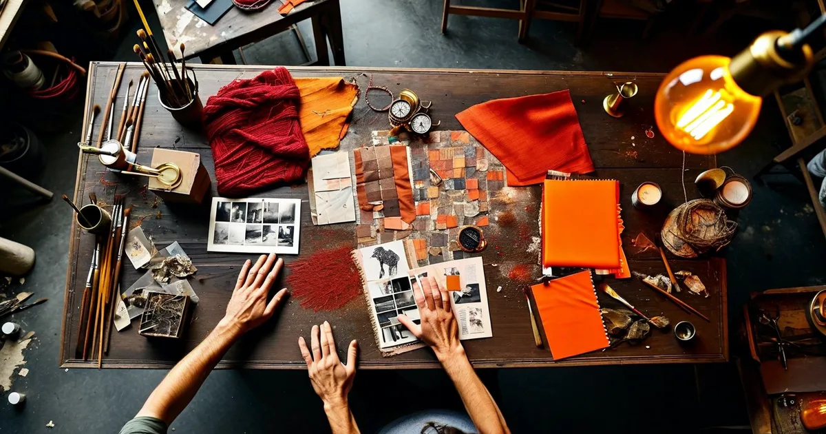
Step 4: Create Mood Boards and Key Visuals
Mood boards translate the conceptual framework into something tangible that stakeholders can react to. A strong mood board includes:
- Reference images (photography, illustration, texture samples)
- Color swatches
- Typography samples in context
- Rough layout sketches
- Inspirational references from other campaigns, art, architecture, or film
The art director then develops key visuals (KVs)—the flagship images or compositions that define the campaign. These are the hero assets from which all other materials are derived. A campaign typically has one to three key visuals.
Step 5: Guide Production and Execution
Once the visual direction is approved, the art director oversees production. This might involve:
- Directing photo or video shoots (lens choices, lighting setups, talent direction)
- Reviewing design comps and providing feedback
- Ensuring every asset—from a 300x250 banner to a 48-sheet billboard—maintains visual integrity
- Collaborating with copywriters to ensure text and image work together
- Adapting the visual system for different channels and formats
This is where the art director’s eye for detail matters most. A typeface that looks elegant at 72px on a desktop screen can become illegible at 14px on a mobile ad. A color that pops on a digital screen may look muddy in CMYK print. The art director catches these issues before they reach the audience.
Step 6: Review, Refine, Deliver
The final stage involves quality control across all deliverables. Art directors conduct visual audits to ensure consistency, checking for issues like:
- Inconsistent spacing or alignment
- Off-brand color usage
- Photography that doesn’t match the approved style
- Typography hierarchy violations
- Accessibility problems (contrast ratios, alt text for imagery)
Teams that follow this structured workflow see measurable results. A 2022 McKinsey study found that companies with strong design practices—including rigorous art direction—outperformed their industry peers by 2:1 in revenue growth.
The Pillars of Effective Art Direction
Regardless of the campaign type, effective art direction rests on a few universal principles.
Visual Hierarchy
Every composition should guide the viewer’s eye in a deliberate order. The most important element (headline, product, call to action) should be seen first. Art directors use size, contrast, color, and placement to establish this hierarchy.
A common framework is the Z-pattern for web pages and the F-pattern for text-heavy layouts. Eye-tracking studies by the Nielsen Norman Group consistently confirm that users scan content in these predictable patterns.
Emotional Resonance
People don’t remember specifications—they remember how something made them feel. Art direction is fundamentally about emotional engineering. Warm tones evoke comfort; cool tones suggest professionalism. Tight crops create intimacy; wide shots evoke freedom.
Nike’s “Just Do It” campaigns are a masterclass in emotionally charged art direction. The photography is always high-contrast, tightly composed, and focused on human effort. The visuals don’t sell shoes—they sell determination.
Consistency Across Channels
A modern campaign might span Instagram, Google Ads, email, a landing page, a YouTube pre-roll, physical signage, and packaging—all at once. The art director’s job is to ensure that a consumer encountering the campaign on any of these channels instantly recognizes it as the same campaign.
This doesn’t mean every asset looks identical. It means every asset feels like it belongs to the same family. Think of Apple’s product launches: the website, the keynote slides, the retail displays, and the social media posts all look different in format—but unmistakably unified in visual language.
Restraint
One of the hardest skills in art direction is knowing what to leave out. Overcrowded compositions, excessive color palettes, and too many typefaces are hallmarks of undirected design. Strong art direction is often defined by what it eliminates.
The principle is simple: every visual element should earn its place. If it doesn’t serve the message, it’s noise.
Real-World Examples of Exceptional Art Direction
Spotify Wrapped
Spotify’s annual “Wrapped” campaign is a benchmark for digital art direction. Each year, the team develops a new visual system—bold gradients, custom typography, data-driven infographics—that is instantly recognizable and highly shareable. The art direction adapts seamlessly from in-app stories to social media cards to outdoor advertising. The 2023 edition generated over 200 million shares across social platforms.
Airbnb’s “Made Possible by Hosts”
Airbnb’s 2021 campaign used a consistent visual style—candid photography, soft natural light, real homes instead of styled sets—to communicate authenticity. The art direction intentionally avoided the polished, aspirational look of traditional travel advertising. The result was a campaign that felt genuine and trustworthy, contributing to a 24% increase in bookings in the following quarter.
Lueur Externe’s Client Campaigns
At Lueur Externe, the web agency based in the Alpes-Maritimes, art direction is treated as a foundational step in every web project—not an afterthought. Whether building a custom Prestashop e-commerce site or launching a WordPress-based brand platform, the team invests in defining the visual concept before a single pixel is placed. This approach, refined since 2003, consistently results in lower revision rates, faster project timelines, and digital experiences that genuinely reflect the client’s brand DNA.
Tools of the Trade
Modern art directors rely on a mix of strategic and production tools:
- Figma / Adobe XD: Collaborative design and prototyping
- Adobe Creative Suite (Photoshop, Illustrator, InDesign): Asset creation and print production
- Miro / Milanote: Digital mood boarding and visual brainstorming
- Notion / Confluence: Documentation of style guides and campaign briefs
- After Effects / Rive: Motion design and animation
- Coolors / Adobe Color: Palette generation and accessibility checking
- Contrast Checker (WebAIM): Ensuring WCAG compliance for digital campaigns
The tool matters less than the thinking behind it. A mood board in Milanote is only as good as the strategic decisions it represents.
Common Mistakes in Art Direction (and How to Avoid Them)
Even experienced teams fall into these traps:
- Starting with aesthetics instead of strategy. A beautiful visual that doesn’t serve the campaign message is a failure. Always start with the brief.
- Designing for one channel only. A hero image that works on desktop may fall apart on mobile or in a vertical social format. Art direction must be responsive by default.
- Ignoring accessibility. Roughly 15% of the global population lives with some form of disability. Art direction that ignores color contrast, readability, and alt text excludes a massive audience segment.
- Failing to document the visual system. If the art direction lives only in the art director’s head, it cannot scale. Document everything—colors, type rules, image guidelines, spacing systems.
- Trend-chasing without purpose. Using a glassmorphism effect or a brutalist layout because it’s trendy—without considering whether it fits the brand—dilutes identity rather than strengthening it.
How Art Direction Impacts SEO and Digital Performance
Art direction might seem purely visual, but it has direct implications for digital performance:
- Bounce rate: Well-directed landing pages with clear visual hierarchy keep users engaged longer. Google’s Core Web Vitals reward pages that deliver a strong user experience.
- Click-through rate: Ads and social posts with cohesive, professional art direction consistently outperform generic stock-photo-based creatives. Facebook’s internal data suggests that high-quality creative accounts for up to 56% of ad performance.
- Brand search volume: Memorable campaigns drive branded searches, which are a strong SEO signal.
- Image SEO: Properly art-directed imagery—with descriptive file names, alt text, and optimized file sizes—contributes to image search visibility.
This intersection of visual excellence and technical performance is precisely where an agency like Lueur Externe operates, combining certified Prestashop and WordPress expertise with a deep understanding of how design decisions impact search rankings and conversion rates.
Conclusion: Invest in Art Direction, Invest in Results
Art direction is not a luxury reserved for Fortune 500 brands and Super Bowl ads. It is a strategic discipline that any business—from a local boutique to a scaling SaaS company—can and should embrace.
The ROI is clear: stronger brand recall, higher engagement, fewer wasted revisions, and a visual identity that audiences recognize and trust. In a digital landscape where consumers are exposed to an estimated 10,000 brand messages per day, the campaigns that cut through the noise are the ones guided by intentional, skilled art direction.
If you’re preparing a campaign—whether it’s a product launch, a website redesign, or a seasonal marketing push—start with the visuals. Start with a strategy. Start with art direction.
Need expert guidance? The team at Lueur Externe has been leading visual and digital projects since 2003. From brand strategy to full campaign execution, we bring the art direction rigor your project deserves. Get in touch today and let’s build something worth looking at.