Why Grid Systems Matter in Print Design
Every beautifully designed magazine spread, every elegantly typeset book, every brochure that just feels right—they all share one invisible secret: a well-constructed grid system.
Layout grid systems are the backbone of print composition. They impose order on chaos, guide the reader’s eye, and ensure that every element on the page—headlines, body copy, images, captions—has a logical place. Without a grid, even the most talented designer risks producing work that looks inconsistent, cluttered, or unprofessional.
But grids are not prisons. They are frameworks. The best designers understand when to follow the grid religiously and when to break it for dramatic effect. In this comprehensive guide, we’ll explore the core composition principles behind layout grid systems, walk through the most common grid types, and share practical tips you can apply to your next print project.
A Brief History of the Grid in Print
Grid systems aren’t a modern invention. Medieval scribes used simple column structures to organize manuscripts long before Gutenberg’s press. However, the formalized grid as we know it emerged in the mid-20th century through the work of Swiss typographers like Josef Müller-Brockmann and Jan Tschichold.
Müller-Brockmann’s 1961 book Grid Systems in Graphic Design became the definitive reference. His approach—rooted in mathematical proportions and visual clarity—influenced everything from corporate identity programs to editorial design.
Key milestones in grid history:
- 1450s: Gutenberg’s Bible uses a two-column manuscript grid
- 1920s: Bauhaus and De Stijl movements explore geometric composition
- 1940s–1960s: Swiss/International Typographic Style formalizes grid methodology
- 1980s: Desktop publishing (DTP) makes grid-based layout accessible to everyone
- 2000s–present: Grids evolve for responsive web design, but print grids remain foundational
Understanding this history isn’t academic—it gives you a vocabulary and a tradition to draw from when making composition decisions today.
Core Composition Principles
Alignment and Consistency
Alignment is the most fundamental principle a grid enforces. When elements align to common vertical or horizontal lines, the layout instantly feels more organized. Readers may not consciously notice alignment, but they feel its absence.
In practical terms, this means:
- Headlines, body text, and captions should snap to the same vertical column edges
- Image edges should align with text columns, not float arbitrarily
- Consistent spacing (margins and gutters) should be maintained page to page
A study by the MIT AgeLab found that consistent alignment and predictable layout patterns improve reading speed by up to 22%. In print, where you can’t scroll or click away, that efficiency matters enormously.
Proximity and Grouping
Related content should be visually grouped. A grid helps you enforce proximity rules by defining clear regions. For example, a photo caption should sit closer to its image than to the next paragraph of body text. The grid’s rows and gutters make these spatial relationships measurable and repeatable.
White Space (Negative Space)
Beginners tend to fill every square centimeter of a page. Experienced designers know that white space is not wasted space—it’s a compositional tool. Generous margins and breathing room around elements improve readability and convey sophistication.
The classic Van de Graaf canon, used since medieval times, dedicates roughly 44% of a page to margins. While modern designs may not follow this exactly, the principle holds: don’t crowd the page.
Visual Hierarchy
A grid alone doesn’t create hierarchy—but it enables it. By allocating different numbers of columns to different elements, you establish importance:
- A hero image spanning all 6 columns signals dominance
- A pull quote occupying 2 columns in a 6-column grid draws attention without overwhelming
- A sidebar confined to 1 column clearly communicates secondary status
Rhythm and Repetition
Multi-page print projects—magazines, annual reports, catalogs—need rhythm. A grid ensures that recurring elements (page numbers, headers, section dividers) appear in the same position throughout, creating a visual pulse that makes the document feel unified.
Types of Grid Systems
Not all grids are created equal. The type you choose should match your content’s complexity and your design goals.
Manuscript Grid (Single-Column)
The simplest grid: one large text block surrounded by margins. It’s used for novels, essays, and long-form reading.
Best for: Books, academic papers, long reports
Limitations: Limited flexibility for mixed content (images + text)
Column Grid
The workhorse of editorial design. Pages are divided into 2, 3, 4, or more vertical columns. Text and images can span one or multiple columns.
Best for: Magazines, newspapers, newsletters, brochures
Common configurations:
| Columns | Typical Use | Flexibility |
|---|---|---|
| 2 | Simple brochures, basic reports | Low |
| 3 | Newsletters, magazine features | Medium |
| 4 | Newspapers, complex brochures | High |
| 6 | Editorial design, catalogs | Very high |
| 12 | Maximum flexibility layouts | Expert-level |
A 12-column grid is particularly powerful because 12 divides evenly by 2, 3, 4, and 6—giving you enormous layout combinations from a single underlying structure.
Modular Grid
A modular grid adds horizontal divisions (called modules or fields) to the vertical columns, creating a checkerboard-like matrix. This gives you both vertical and horizontal reference points.
Best for: Image-heavy layouts, catalogs, data-dense pages, exhibition catalogs
Example: A product catalog page might use a 4×5 modular grid where each product card occupies exactly one module, ensuring perfect alignment across dozens of pages.
Hierarchical Grid
Not based on regular intervals, a hierarchical grid is custom-built around the content. Zones are defined organically based on what the content requires.
Best for: Posters, advertising, one-off promotional pieces
Trade-off: Maximum creative freedom, but harder to maintain consistency across multiple pages.
Baseline Grid
Often used in addition to a column or modular grid, the baseline grid is a series of evenly spaced horizontal lines that text sits on—like ruled notebook paper. It ensures that text across adjacent columns aligns perfectly, which is essential for multi-column layouts.
Typical baseline increment: Set to match your body text leading. If your body copy is 10pt type on 14pt leading, your baseline grid is 14pt.
Practical Grid Construction: Step by Step
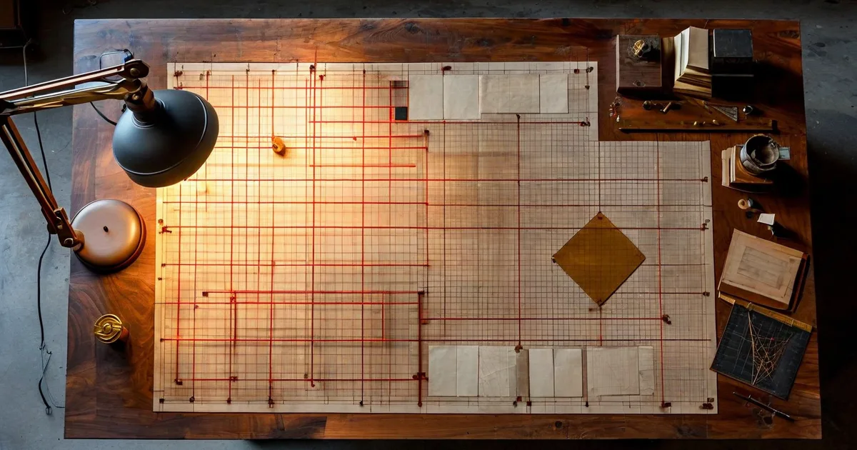
Let’s walk through constructing a grid for a common print project: an A4 magazine spread (420mm × 297mm open).
Step 1: Define Margins
Start with the outer boundaries. Standard margin values for an A4 magazine:
- Top margin: 15mm
- Bottom margin: 20mm
- Inside margin (spine): 20mm
- Outside margin: 15mm
The inside margin is wider to account for binding. The bottom margin is larger than the top to optically center the text block (a principle dating back to Tschichold).
Step 2: Choose Column Count and Gutter Width
For a general-interest magazine, a 6-column grid offers excellent flexibility.
- Live area width (after margins): 420mm – 15mm – 20mm – 20mm – 15mm = 350mm (across the full spread)
- Gutter width: 4mm
- Calculation: With 6 columns and 5 gutters per page (spread has 12 columns, 11 gutters):
Total gutter space = 11 gutters × 4mm = 44mm
Total column space = 350mm - 44mm = 306mm
Column width = 306mm / 12 = 25.5mm per column
Each column is 25.5mm wide. Text typically runs across 2 or 3 columns (51mm or 80.5mm), giving comfortable line lengths for body copy.
Step 3: Set the Baseline Grid
If body text is 9.5pt on 13pt leading:
- Baseline grid increment = 13pt ≈ 4.586mm
- All text, headings, and image positions snap to multiples of this value
Step 4: Create Master Page Templates
In InDesign (or your layout tool of choice), build master pages with:
- Column guides
- Baseline grid
- Recurring elements (folio, running headers, section markers)
This master page becomes the DNA of the entire publication.
The Golden Ratio and the Rule of Thirds
Two composition principles frequently intersect with grid design:
The Rule of Thirds
Divide the page into a 3×3 grid. Place key elements at the four intersection points for naturally balanced, dynamic compositions. This principle, borrowed from photography, works beautifully in print.
For example, place a headline at the upper-left intersection and a dominant image anchored to the lower-right intersection. The result feels energetic but balanced.
The Golden Ratio (1:1.618)
The golden ratio can inform:
- Page proportions: An A4 page is close to but not exactly golden (its ratio is 1:1.414). Some designers prefer custom page sizes at 1:1.618.
- Margin ratios: Inner margin to outer margin, or top to bottom, at a 1:1.618 ratio
- Content placement: Dividing the page width at the golden section (approximately 62%/38%) to position a dominant column
While the golden ratio isn’t magic, it does produce proportions that feel inherently pleasing. Many classical book layouts—and even modern ones—echo this ratio.
Common Grid Mistakes (and How to Avoid Them)
Even experienced designers fall into grid traps. Here are the most frequent ones:
- Too many columns without a plan: A 12-column grid is powerful, but if you don’t have a clear system for how elements span columns, the result is chaotic rather than flexible.
- Ignoring the baseline grid: When body text doesn’t align across columns, the layout looks subtly “off.” Always lock body copy to the baseline.
- Uniform gutters throughout: Sometimes wider gutters between sections and narrower gutters within sections create better visual grouping. Don’t be afraid to vary.
- No intentional grid breaks: If everything rigidly follows the grid, the layout can feel mechanical. Plan 1–2 deliberate grid breaks per spread—a full-bleed image, a pull quote that bridges the gutter—to add energy.
- Forgetting the fold/spine: In saddle-stitched brochures or perfect-bound books, content near the spine can disappear. Always add extra inside margin.
Grid Systems in the Digital-Print Crossover
Today, many projects require both print and digital deliverables—a brochure that’s also a PDF download, a catalog that mirrors an e-commerce site. At Lueur Externe, we’ve seen firsthand how establishing a strong grid system at the print stage makes the transition to web far smoother. A 12-column print grid, for instance, maps naturally to Bootstrap’s 12-column responsive grid, creating visual consistency across media.
This crossover thinking is increasingly important. According to a 2023 Statista report, 62% of marketers produce both print and digital versions of their key collateral. Starting with a well-thought-out grid ensures that your brand looks cohesive whether it’s on a glossy brochure or a mobile screen.
Tools for Grid-Based Print Layout
Here are the industry-standard tools that support grid-based print design:
- Adobe InDesign: The gold standard. Full support for column grids, modular grids, baseline grids, and master pages. Used by 90%+ of professional print designers.
- Affinity Publisher: A powerful, affordable alternative with excellent grid functionality.
- QuarkXPress: Still used in some legacy publishing workflows.
- Canva (Pro): Limited grid tools, but improving. Suitable for simple projects.
- Scribus: Free and open-source, with basic grid support.
For professional multi-page print work, InDesign remains the clear leader. Its grid and guide system is the most sophisticated, and its integration with the Creative Cloud ecosystem (Photoshop, Illustrator) is unmatched.
Real-World Example: Redesigning a 48-Page Corporate Report
To illustrate these principles in action, consider a project the team at Lueur Externe worked on: a 48-page annual corporate report for a client in the technology sector.
The original report used an ad hoc layout—different margins on different pages, inconsistent image sizing, and body text that wandered from two columns to three columns without logic.
The redesign process:
- Established a 6-column modular grid with a 14pt baseline grid
- Defined three layout templates: text-heavy (body copy spanning 4 columns), data-heavy (tables and charts using the full 6 columns), and visual (full-bleed photography with overlaid text blocks)
- Applied a strict hierarchy: H1 at 28pt, H2 at 18pt, body at 9.5pt, captions at 8pt—all locked to the baseline
- Introduced intentional grid breaks: One full-bleed image per chapter opener, pull quotes bridging the gutter
The result: production time dropped by 35% (because the grid eliminated guesswork), reader feedback improved, and the client’s brand consistency score—measured via an internal audit—rose from 64% to 91%.
Composition Tips from the Experts
To round out this guide, here are actionable tips distilled from decades of professional print design practice:
- Start with content, not aesthetics: Understand how much text, how many images, and what data you need to present before choosing a grid. The grid should serve the content, not the other way around.
- Use an even number of columns for symmetry, an odd number for dynamism: A 4-column grid feels balanced; a 5-column grid creates asymmetric tension that can be very effective.
- Print test pages early: Grids look different on screen versus on paper. Print at actual size to check margins, line lengths, and overall feel.
- Keep line length between 45–75 characters: This is the readability sweet spot for body text. Your column width and font size should produce lines in this range.
- Document your grid: Create a style guide page that specifies all grid measurements, type sizes, and spacing rules. This is essential when multiple designers work on the same project.
Conclusion: The Grid as Creative Foundation
A layout grid system is not a constraint—it’s a creative foundation. It frees you from making dozens of micro-decisions on every page and lets you focus on what matters: telling a visual story, guiding the reader, and reinforcing the brand.
Whether you’re designing a two-panel flyer or a 200-page coffee-table book, the principles are the same: define your margins, choose your columns, set your baseline, and then compose with intention. Know the rules so you can break them purposefully.
At Lueur Externe, we bring over 20 years of expertise in design, web development, and brand strategy to every project—print and digital alike. If you need help creating print materials that are visually stunning, structurally sound, and perfectly aligned with your digital presence, get in touch with our team. We’d love to help you build something remarkable.