Why Most Sales Brochures End Up in the Bin
Let’s be honest: the majority of sales brochures get a two-second glance before landing in a drawer — or worse, the recycling bin. According to a 2023 study by the Printing Industries of America, 79% of consumers say they scan a brochure for less than 10 seconds before deciding whether to read further.
The problem isn’t print itself. The problem is design without strategy. A sales brochure isn’t a mini-catalog; it’s a persuasion tool. Here’s how to build one that actually sells.
Start With Strategy, Not Aesthetics
Define the Single Goal
Before opening any design software, answer one question: what should the reader do after reading this brochure? Book a call? Visit a showroom? Request a quote?
Every element — headline, images, layout — should funnel toward that one action. Brochures that try to do everything (introduce the brand, list every product, tell the company story) end up doing nothing.
Know Your Audience Intimately
A brochure for luxury real estate investors looks nothing like one for industrial equipment buyers. Consider:
- Pain points your audience faces daily
- Language register they expect (technical vs. aspirational)
- Decision-making triggers (data, testimonials, visuals)
The Anatomy of a Brochure That Converts
The Cover: Your 3-Second Audition
Your front panel needs three things:
- A benefit-driven headline — not your company name in 72pt font
- One striking visual — avoid generic stock photos at all costs
- A subtle hook — a statistic, a question, or a bold promise
For example, instead of “ABC Solutions — Your Trusted Partner,” try: “Cut Procurement Costs by 30% — Here’s How.”
Inside Panels: Build Desire With Structure
Use a clear visual hierarchy:
- H2 headings that state benefits, not features
- Short paragraphs of 2-3 sentences maximum
- Bullet points for scannable information
- Infographics or icons to replace dense text blocks
A study by the Nielsen Norman Group found that users read only 20-28% of text on a page. In print, the ratio is similar. White space isn’t wasted space — it’s breathing room for your message.
The Back Panel: Close the Deal
This is where most brochures fail. The back panel should contain:
- A clear, compelling call to action (“Call now for a free audit”)
- Contact details — phone, email, QR code linking to a landing page
- Social proof — a short testimonial or a trust badge
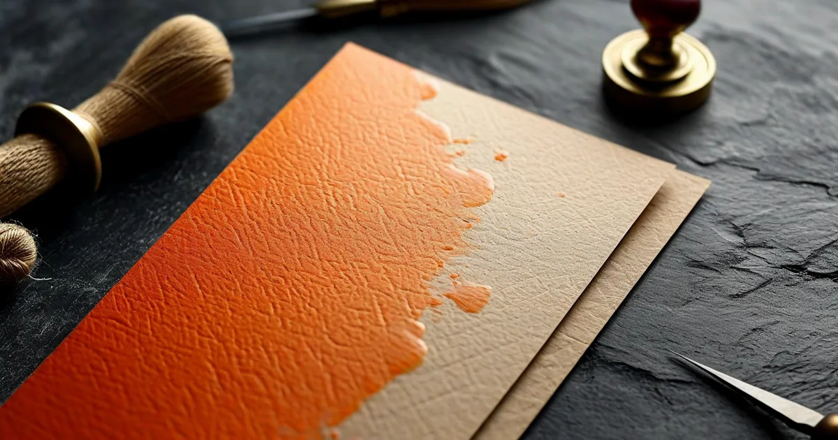
Print Choices That Influence Perception
Design doesn’t stop at the screen. The physical experience matters enormously:
| Element | Budget Option | Premium Option | Impact on Perception |
|---|---|---|---|
| Paper weight | 135 gsm gloss | 300 gsm matte | +40% perceived value |
| Finish | Standard gloss | Soft-touch laminate | Stronger tactile memory |
| Format | A5 bi-fold | Custom die-cut | Higher engagement |
At Lueur Externe, we’ve seen firsthand that upgrading from a standard gloss trifold to a soft-touch laminated format increased client callback rates by 18% in a comparative campaign for a luxury hospitality brand.
Common Mistakes to Avoid
- Cramming too much text — if it reads like a white paper, it won’t be read at all
- Ignoring bleed and safe zones — amateur margins scream low budget
- Using low-resolution images — anything below 300 DPI will look blurry in print
- Forgetting a CTA — a beautiful brochure without a next step is just expensive art
Conclusion: Print With Purpose
A sales brochure remains one of the most powerful tools in your marketing arsenal — but only when design serves strategy. Focus on one clear goal, respect your reader’s time, invest in quality print finishes, and never forget the call to action.
If you’re ready to create a brochure that doesn’t just look impressive but genuinely drives sales, the graphic design and web experts at Lueur Externe can help you from concept to print-ready files. With over 20 years of experience in visual communication and digital strategy, we know how to make every panel count.