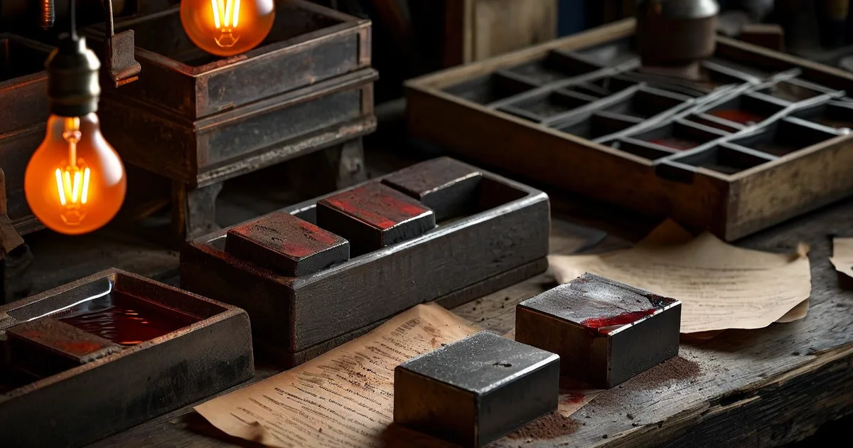
Why Print Layout Still Matters in a Digital World
In an era dominated by screens, it might seem like print design is fading into irrelevance. Nothing could be further from the truth. The global print industry was valued at over $800 billion in 2023, and business cards, brochures, packaging, posters, and catalogs remain essential tools for brand communication.
But here is the uncomfortable reality: up to 25% of first print runs contain avoidable errors, according to industry estimates from the Printing Industries of America. These errors cost businesses thousands in reprints, delays, and damaged credibility.
Whether you are a seasoned graphic designer or a business owner preparing files for a local print shop, understanding common print layout pitfalls—and how to avoid them—is essential. This guide walks you through every critical aspect, from color modes to pre-flight checklists.
The Fundamental Difference: Screen Design vs. Print Design
Before diving into specific pitfalls, let’s establish a foundational truth that trips up even experienced designers: designing for screen and designing for print are fundamentally different disciplines.
Color: RGB vs. CMYK
Screens emit light. They use the RGB (Red, Green, Blue) color model, which is additive—combine all colors and you get white. Printers lay down ink on paper. They use the CMYK (Cyan, Magenta, Yellow, Key/Black) model, which is subtractive—combine all colors and you get a muddy dark brown (theoretically black).
The practical consequence? RGB can represent approximately 16.7 million colors. CMYK can reproduce roughly 1 million. That electric blue on your monitor? It simply cannot exist on paper.
Resolution: Pixels vs. Dots
A website image at 72 DPI looks perfectly crisp on screen. Print that same image and it will look blurry, pixelated, and amateurish. Print demands 300 DPI at the final output size—no exceptions.
Units: Pixels vs. Millimeters
Web designers think in pixels. Print designers think in millimeters (or inches). Confusing the two leads to files that are the wrong physical size—a surprisingly common mistake.
The 8 Most Common Print Layout Pitfalls
Pitfall #1: No Bleed (or Incorrect Bleed)
This is the single most frequent error print shops encounter. Bleed is the extension of your design beyond the trim line—typically 3 mm (0.125”) on all four sides.
Without bleed, the cutting machine has zero margin for error. Even a 0.5 mm shift during trimming will leave a visible white line along one or more edges.
Example: You design an A4 flyer (210 × 297 mm) with a dark blue background that extends to the edge. Without bleed, your file is 210 × 297 mm. With proper bleed, it should be 216 × 303 mm (adding 3 mm on each side).
Pitfall #2: Text Too Close to the Trim Edge
Even with bleed set correctly, many designers place text or logos dangerously close to the cut line. The industry-standard safe zone (also called the safety margin) is at least 5 mm (0.2”) from the trim edge.
Anything within that 5 mm zone risks being partially cut off or looking uncomfortably close to the edge.
Pitfall #3: Using RGB Instead of CMYK
We touched on this above, but it bears repeating because of how often it happens. Here is a quick comparison of how certain colors shift:
| Color Description | RGB Value | Approximate CMYK Equivalent | Visible Shift? |
|---|---|---|---|
| Vivid Red | R:255 G:0 B:0 | C:0 M:100 Y:100 K:0 | Moderate |
| Electric Blue | R:0 G:100 B:255 | C:90 M:65 Y:0 K:0 | Severe |
| Neon Green | R:0 G:255 B:0 | C:70 M:0 Y:100 K:0 | Severe |
| Pure Black | R:0 G:0 B:0 | C:0 M:0 Y:0 K:100 | Minimal |
| Soft Pink | R:255 G:182 B:193 | C:0 M:30 Y:15 K:0 | Minimal |
| Deep Purple | R:75 G:0 B:130 | C:85 M:100 Y:0 K:10 | Moderate |
Notice that the most saturated, bright colors (neon green, electric blue) suffer the most dramatic shifts. If brand accuracy is paramount, consider using Pantone spot colors for critical elements.
Pitfall #4: Low-Resolution Images
This is the pitfall that causes the most visible damage on the final print. A 72 DPI image downloaded from a website will print at roughly one-quarter of its intended quality at 300 DPI.
Quick math: An image that is 1000 × 1000 pixels at 72 DPI prints at about 3.5 × 3.5 inches. At 300 DPI, that same image should only be printed at approximately 3.3 × 3.3 inches for optimal clarity. Need it bigger? You need a higher-resolution source file.
Pitfall #5: Incorrect Black Values
Not all blacks are created equal in print.
- Pure black (C:0 M:0 Y:0 K:100) is fine for body text.
- Rich black (typically C:60 M:40 Y:40 K:100) is far deeper and more visually appealing for large areas like backgrounds or bold headlines.
Using pure black for a full-page background will result in a washed-out, grayish appearance. Conversely, using rich black for small text can cause registration issues where the colors misalign slightly, creating a blurry, shadowed effect.
Pitfall #6: Forgetting to Outline Fonts
If the print shop does not have the exact font file installed on their system, your carefully chosen typography will default to a substitute—often Courier or Times New Roman. The fix is simple: convert all text to outlines (also called “creating outlines” or “converting to curves”) before exporting your final file.
In Adobe Illustrator, this is as straightforward as:
Select All Text → Type → Create Outlines
(Shortcut: Ctrl+Shift+O / Cmd+Shift+O)
In InDesign, you can outline fonts during PDF export or manually via:
Select text frame → Type → Create OutlinesWarning: Once you outline fonts, you can no longer edit the text. Always keep an editable backup copy of your file.
Pitfall #7: Overloading Total Ink Coverage
Most commercial printing presses have a maximum total ink coverage (TIC) limit, typically 300% to 340%. Total ink coverage is the sum of C + M + Y + K percentages at any given point.
For example, a rich black of C:60 M:40 Y:40 K:100 has a TIC of 240%—well within limits. But a color like C:100 M:100 Y:100 K:100 has a TIC of 400%, which will cause the paper to become oversaturated, take forever to dry, smear, and potentially jam the press.
Pitfall #8: Exporting in the Wrong File Format
Not all file formats are suitable for professional printing. Here is a quick breakdown:
- PDF/X-1a or PDF/X-4 — The gold standard for print. Embeds fonts, flattens transparencies (X-1a), supports layers and transparency (X-4).
- TIFF — Excellent for raster images, lossless compression, supports CMYK.
- EPS — Legacy format, still accepted but increasingly replaced by PDF.
- JPEG — Lossy compression. Acceptable for photos within a layout but never as the final deliverable.
- PNG — RGB only, no CMYK support. Never use for print.
Best Practices: A Professional Print Layout Workflow
Now that we have identified the pitfalls, let’s build a positive workflow that prevents them from occurring in the first place.
Start With the Right Document Settings
Before placing a single element on the canvas, configure your document correctly:
- Color mode: CMYK
- Resolution: 300 DPI (or 300 PPI in Photoshop terminology)
- Bleed: 3 mm on all sides (or per your printer’s specifications)
- Units: Millimeters or inches (never pixels)
- Color profile: Fogra39 (for European coated paper) or SWOP v2 (for US web offset)
Getting these settings right at the beginning is infinitely easier than trying to correct them later.
Use a Grid System
Professional print layouts rely on grids to create visual harmony, consistent margins, and balanced white space. A common approach for an A4 brochure is a 12-column grid with 4–5 mm gutters and 12–15 mm margins.
Grids are not constraints—they are frameworks that accelerate decision-making and produce cleaner, more professional results.
Choose Fonts Strategically
Print has different demands than screen when it comes to typography:
- Body text: Use a minimum size of 8 pt for comfortable reading. 10–12 pt is ideal.
- Fine print / legal text: Never go below 6 pt.
- Thin or light font weights: Be cautious. Extremely thin strokes (below 0.25 pt) may not reproduce well, especially on uncoated paper.
- Reverse text (white text on dark background): Increase the font weight by one step. A Regular weight on a dark background often appears thinner than the same Regular on white.
Maintain Consistent Color Usage
At Lueur Externe, when we prepare brand guidelines for our clients, we always specify both digital (RGB/Hex) and print (CMYK/Pantone) color values. This dual specification is a small detail that prevents enormous headaches down the road.
Here is an example of how a brand color sheet might look:
Brand Color: "Ocean Blue"
──────────────────────────
Digital (Screen):
  HEX:  #1A73E8
  RGB:  R:26  G:115  B:232

Print (Press):
  CMYK: C:89  M:55  Y:0  K:0
  Pantone: 2728 C

Total Ink Coverage: 144% ✓
This approach ensures that whether the brand appears on a website, a social media post, a business card, or a billboard, the color remains as consistent as physically possible across media.
Communicate With Your Printer Early
One of the most overlooked best practices is simply talking to your print vendor before you start designing. Every print shop and press has its own specifications, quirks, and preferences.
Key questions to ask your printer:
- What bleed do you require?
- What is your maximum total ink coverage?
- Do you prefer PDF/X-1a or PDF/X-4?
- What ICC color profile should I use?
- Do you handle folding, and if so, where should fold lines be placed in the file?
- What is the minimum line weight you can reproduce?
A five-minute phone call can save days of back-and-forth corrections.
The Pre-Flight Checklist: Your Last Line of Defense
Before exporting your final file, run through this checklist systematically. In the print industry, this process is called pre-flighting, borrowed from aviation terminology where pilots check every system before takeoff.
- ☑ Document is in CMYK color mode
- ☑ All images are at least 300 DPI at 100% print size
- ☑ Bleed is set to 3 mm (or per printer specs) on all sides
- ☑ All critical content is within the safe zone (5 mm from trim)
- ☑ All fonts are outlined or embedded
- ☑ No RGB images remain in the layout
- ☑ Total ink coverage does not exceed 300–340% anywhere
- ☑ Blacks are set correctly (pure K for text, rich black for backgrounds)
- ☑ All linked images are present and high-resolution
- ☑ Exported format is PDF/X-1a or PDF/X-4
- ☑ Crop marks and bleed marks are included in the PDF
- ☑ File has been proofed at 100% zoom for visual errors
Adobe InDesign has a built-in Preflight panel (Window → Output → Preflight) that catches many of these issues automatically. Use it religiously.
Real-World Case Study: When a Missing Bleed Costs Real Money
Consider this scenario: a mid-sized company orders 10,000 tri-fold brochures for an annual trade show. The designer delivers the file without bleed. The print shop runs the job, and during trimming, a 1 mm shift on the left side creates a visible white strip.
The result:
- 10,000 brochures are unusable for a premium brand presentation.
- Cost of the first run: approximately €2,500.
- Cost of the reprint: another €2,500 plus rush fees (~€500).
- Delayed delivery to the trade show by 4 days.
- Total additional cost: ~€3,000 and significant stress.
All because of 3 mm of missing bleed.
This is exactly the kind of scenario that the design team at Lueur Externe helps clients avoid. With over 20 years of experience since 2003 in both digital and print design, we understand that the gap between a “finished design” and a “print-ready file” is where most projects fail.
Special Considerations for Different Print Products
Business Cards
- Standard size: 85 × 55 mm (Europe) or 3.5 × 2” (US)
- Use rich black if the background is solid black
- Keep text at least 3 mm from cut edges (the card is small—every millimeter matters)
- If using a die-cut or rounded corner, request the template from your printer
Brochures and Folded Pieces
- The inner fold panel on a tri-fold is typically 1–2 mm narrower than the outer panels
- Always request a folding template from your printer
- Consider how images flow across panels—misalignment at the fold is highly visible
Large Format (Posters, Banners, Signage)
- Resolution can be reduced to 150 DPI for items viewed from a distance (e.g., a 2-meter banner)
- For billboards, 72 DPI or even lower is common because viewing distance is 10+ meters
- Use vector graphics wherever possible for infinite scalability
Packaging
- Requires dieline templates showing where cuts, folds, and glue tabs occur
- Overprint settings become critical—a logo on a colored background may knock out the background color unexpectedly
- Regulatory text (ingredients, barcodes) must meet minimum size and contrast requirements
Tools of the Trade
While this article focuses on principles rather than software tutorials, it is worth noting the industry-standard tools for professional print layout:
- Adobe InDesign — The undisputed leader for multi-page print layouts (brochures, catalogs, magazines).
- Adobe Illustrator — Best for single-page designs, logos, and vector-heavy print pieces.
- Adobe Photoshop — Image editing and preparation, not layout. Use it to prepare images at 300 DPI in CMYK, then place them into InDesign or Illustrator.
- Affinity Publisher / Affinity Designer — Strong, affordable alternatives to Adobe’s suite with excellent print output capabilities.
- Canva — Increasingly used by non-designers. While it has improved its print features, it still lacks precise control over bleed, color profiles, and ink coverage. Not recommended for high-end professional printing.
Conclusion: Print Right the First Time
Professional print layout is not about artistic genius alone—it is about technical precision combined with creative vision. The most beautiful design in the world is worthless if it arrives from the press with shifted colors, cropped text, or pixelated images.
The good news? Every single pitfall in this article is 100% preventable. With the right document setup, a solid workflow, open communication with your printer, and a thorough pre-flight checklist, you can send files to press with complete confidence.
If you are looking for a partner who understands both the technical and creative sides of design—from pixel-perfect web interfaces to print-ready brand collateral—Lueur Externe has been delivering that dual expertise since 2003. Based in the Alpes-Maritimes, our team bridges the gap between digital and print with precision, care, and over two decades of experience.
Ready to ensure your next print project is flawless from the start? Get in touch with Lueur Externe and let’s make it happen.