Why Visual Content Strategy Is No Longer Optional
We live in a scroll-first world. The average user spends just 1.7 seconds on a piece of mobile content before deciding to engage or move on (Microsoft Attention Spans Research). In that blink of time, your photography does the heavy lifting — it tells visitors who you are, what you stand for, and whether you’re worth their trust.
A visual content strategy is the deliberate, documented plan that governs every image your brand produces and publishes. It covers photography style, color grading, composition patterns, subject selection, and platform-specific adaptations. Done right, it transforms a scattered collection of pretty pictures into a photographic identity — a visual fingerprint that audiences recognize instantly, whether they encounter it on Instagram, a product page, or a billboard.
According to a 2023 Venngage study, 49% of marketers rate visual content as “very important” to their strategy, yet fewer than 30% have a formal style guide governing their imagery. That gap is an opportunity. Brands that close it enjoy higher engagement rates, stronger recall, and ultimately more conversions.
The Business Case for a Consistent Photographic Identity
Brand Recognition and Trust
Lucidpress data shows that consistent brand presentation across all platforms increases revenue by up to 23%. Photography is one of the most visible — and most frequently inconsistent — brand touchpoints. When your website hero images feel polished and editorial, but your social media photos look like unfiltered afterthoughts, you create cognitive dissonance. Visitors may not articulate it, but they feel it as a lack of professionalism.
Engagement Metrics That Prove It
Consider the numbers:
- Blog posts with relevant images get 94% more views than those without (Jeff Bullas).
- Tweets with images receive 150% more retweets (Buffer).
- Product pages with high-quality, consistent photography see conversion rate lifts of 30% or more (Shopify case studies).
These aren’t vanity metrics. They translate directly into revenue.
SEO and Discoverability
Google’s shift toward visual search (via Google Lens and image carousels) means your photographs now compete in search results. Properly optimized, consistently styled images with descriptive alt text, structured data, and fast load times can drive significant organic traffic. At Lueur Externe, we’ve seen clients increase image-driven organic traffic by over 40% after implementing a structured visual content strategy alongside technical SEO best practices.
Anatomy of a Photographic Identity
A photographic identity is more than a mood board pinned to a wall. It’s a living system with clearly defined components. Let’s break them down.
1. Color Palette and Tonal Range
Every brand has primary and secondary colors. Your photography should echo — not clash with — those colors. This doesn’t mean every photo must be drenched in your brand hue, but the overall tonal feeling should be harmonious.
| Element | Example: Warm Brand | Example: Cool Brand |
|---|---|---|
| Dominant tones | Golden, amber, terracotta | Steel blue, slate, silver |
| Highlights | Soft peach, cream | Bright white, ice blue |
| Shadows | Rich chocolate, deep sienna | Charcoal, navy |
| Saturation | Medium-high (inviting) | Low-medium (professional) |
| White balance | Shifted warm (+500K) | Neutral to cool (-200K) |
Defining these parameters means that whether a photo is taken in Paris or Patagonia, it still feels like your brand.
2. Composition Rules
Consistency in composition creates a subconscious visual rhythm. Decide on guidelines for:
- Rule of thirds vs. centered subjects — Editorial brands often favor rule-of-thirds; luxury brands may use deliberate center framing.
- Negative space — How much breathing room surrounds your subject? More space signals sophistication; tighter crops signal energy.
- Angle and perspective — Eye-level feels relatable; slightly elevated angles feel aspirational; overhead (flat-lay) feels organized and curated.
- Text overlay zones — If images will carry headlines, define safe zones where the subject won’t compete with text.
3. Lighting Style
Lighting is arguably the single most influential factor in photographic mood.
- Natural light (golden hour) → warmth, authenticity, lifestyle brands
- Diffused overcast light → even tones, fashion and product photography
- Hard directional light → drama, contrast, bold editorial
- Studio strobe (high key) → clean, medical, tech, e-commerce
Pick a primary lighting approach and a secondary one for variety, then document both.
4. Subject and Styling Guidelines
What appears in the frame matters as much as how it’s lit. Define:
- People — demographics, expressions (candid vs. posed), wardrobe palettes
- Props and environments — materials (wood, marble, linen), settings (urban, natural, studio)
- Products — angles, context (in-use vs. isolated), scale references
- Exclusions — what should never appear (competitor branding, dated technology, cluttered backgrounds)
5. Editing and Post-Processing Standards
Post-processing is where consistency is either locked in or lost. The most effective approach is to create Lightroom presets or Capture One styles that encode your decisions about:
- Exposure compensation
- Contrast curves
- HSL (hue, saturation, luminance) adjustments
- Grain and texture
- Vignetting
- Sharpening
Here’s a simplified example of how you might document a Lightroom preset configuration in your style guide:
# Brand Photography Preset — "Sunrise Standard"
preset_name: sunrise_standard_v3
profile: Adobe Color
exposure: +0.30
contrast: +15
highlights: -40
shadows: +25
whites: +10
blacks: -10
texture: +12
clarity: +8
vibrance: +18
saturation: -5
HSL:
  orange_hue: +8
  orange_saturation: -12
  green_saturation: -30
  blue_luminance: -15
split_toning:
  highlights_hue: 42
  highlights_saturation: 15
  shadows_hue: 220
  shadows_saturation: 8
sharpening:
  amount: 35
  radius: 1.2
grain:
  amount: 18
  size: 25
  roughness: 50
Distributing a preset file (or set of presets) to every photographer, content creator, and social media manager on your team is the single fastest way to enforce visual consistency.
Building Your Visual Content Strategy: A Step-by-Step Framework
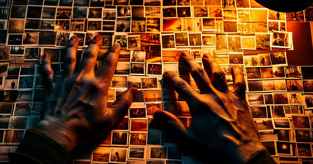
Step 1: Audit Your Current Visual Assets
Before creating anything new, catalogue what you already have. Pull images from:
- Your website (hero banners, product photos, blog images)
- Social media profiles (last 6-12 months)
- Email campaigns
- Printed materials and packaging
- Third-party listings (Amazon, marketplaces)
Spread them side by side — digitally, in a tool like Miro, or physically printed. Ask three questions:
- Do these look like they come from the same brand?
- If a stranger saw them without a logo, could they identify a unified voice?
- Which images perform best, and what do they have in common?
This audit often reveals shocking inconsistency. That’s normal — and it’s exactly why you’re doing this work.
Step 2: Define Your Visual Pillars
Visual pillars are the 3-5 content themes your photography will rotate through. They keep your feed diverse but focused.
Example for an outdoor apparel brand:
- Adventure in action — athletes using the product in dramatic landscapes
- Urban crossover — products styled in everyday city environments
- Craft and detail — macro close-ups of fabrics, stitching, hardware
- Community — real customers, events, ambassador spotlights
- Behind the scenes — design process, factory visits, team culture
Each pillar should have its own sub-guidelines for composition and subject, while sharing the same color palette and editing presets.
Step 3: Create the Visual Style Guide Document
This is the deliverable that keeps everyone aligned. A thorough brand photography style guide typically includes:
- Brand mission and personality summary (for context)
- Color palette with hex codes and Pantone references
- Mood board with 15-25 reference images
- Counter-examples (5-10 images showing what to avoid)
- Composition templates for each platform (Instagram square, Story, website hero, blog thumbnail)
- Lighting guidelines with annotated sample setups
- Editing presets (downloadable files + visual before/after examples)
- File naming and metadata conventions
- Image resolution and format specifications per channel
At Lueur Externe, when we build visual content strategies for our clients — from Prestashop e-commerce stores to corporate WordPress sites — this style guide becomes a cornerstone document that lives alongside brand guidelines and is updated quarterly.
Step 4: Build a Production Workflow
Consistency at scale requires a repeatable workflow. Here’s a proven structure:
- Content calendar — Plan shoots around visual pillars, campaigns, and seasonal needs at least 4-6 weeks ahead.
- Shot list and brief — Before any shoot, create a detailed shot list referencing the style guide. Include location, lighting notes, wardrobe, props, and specific composition templates.
- Shoot day — Follow the brief. Tether to a laptop when possible so the team can review images in real time against the style guide.
- Culling and selection — Use a consistent rating system (e.g., 5-star in Lightroom) and have the same person or small team make final selections to avoid taste drift.
- Editing — Apply the brand preset first, then make minimal per-image adjustments. Avoid the temptation to “experiment” with new looks mid-batch.
- Asset management — Store final images in a DAM (Digital Asset Management) tool like Brandfolder, Bynder, or even a well-organized Google Drive with strict folder taxonomy and naming conventions.
- Distribution — Resize and export for each platform. Attach appropriate metadata, alt text, and captions.
Step 5: Train Your Team (and Your Partners)
A style guide only works if people use it. Invest in:
- Onboarding sessions for new team members and freelancers
- Quarterly visual reviews where you pull recent content and evaluate consistency
- Shared asset libraries where approved templates and presets are always accessible
- Feedback loops — make it easy for photographers to ask “Does this fit?” before a shoot, not after
Common Pitfalls and How to Avoid Them
Over-Reliance on Stock Photography
Stock images are convenient but dangerous for identity. If your competitors use the same library, your audiences will notice — consciously or not. Use stock sparingly, and when you do, edit it through your brand presets to at least unify the tone.
Chasing Trends Over Consistency
That desaturated teal-and-orange look is popular this year. Next year it’ll be something else. Trends can inform your palette, but they shouldn’t define it. A strong photographic identity evolves slowly and deliberately, not seasonally.
Inconsistency Between Platforms
Your Instagram grid might look stunning, but if your website product pages feature flat, overlit images on white backgrounds with no stylistic connection, you’re splitting your identity. Every touchpoint must sing from the same sheet.
Ignoring Image Performance Data
Don’t just set rules and forget them. Monitor which images drive the highest engagement, click-through rates, and conversions. Use heatmaps (Hotjar, Microsoft Clarity) on web pages to see where eyes go. Let data refine your guidelines over time.
Measuring the Impact of Your Photographic Identity
How do you know it’s working? Track these KPIs:
- Brand recognition surveys — pre- and post-implementation, measure unaided recall.
- Social engagement rate — likes, saves, shares, and comments per post, segmented by visual pillar.
- Website bounce rate on image-heavy pages — a drop signals improved relevance.
- Time on page — consistent, high-quality visuals keep visitors exploring.
- Conversion rate — especially on product and landing pages where photography changed.
- Image search traffic — monitor via Google Search Console under the “Image” search type filter.
Set benchmarks before you launch the new strategy, then measure at 30, 60, and 90 days.
Real-World Example: The Power of a Unified Look
Consider how Airbnb transformed its visual strategy in 2014 by investing in professional photography for listings. Hosts who received professional photos saw bookings increase by 2 to 3 times compared to those with amateur snapshots. But the real brand play was that every Airbnb photo — regardless of location — shared a consistent warmth, natural light feel, and wide-angle perspective that said: “This place is welcoming and real.”
That’s photographic identity at scale. You don’t need Airbnb’s budget to achieve the same principle — you just need a clear guide, the right presets, and the discipline to follow through.
Tools to Support Your Visual Content Strategy
Here’s a quick overview of tools that can help at every stage:
| Stage | Tool | Purpose |
|---|---|---|
| Planning | Trello, Notion, Asana | Content calendar and shot list management |
| Mood boarding | Milanote, Pinterest, Miro | Collecting and organizing visual references |
| Shooting | Capture One (tethered), Lightroom Mobile | On-set review and rating |
| Editing | Adobe Lightroom, Capture One, VSCO | Preset-based batch editing |
| Asset management | Brandfolder, Bynder, Google Drive | Organized storage with metadata |
| Distribution | Later, Buffer, Hootsuite | Scheduled, platform-optimized publishing |
| Performance | Google Analytics 4, Search Console, Hotjar | Measuring visual content impact |
Conclusion: Your Brand Deserves a Visual Fingerprint
A consistent photographic identity is not a luxury reserved for global corporations with million-dollar creative budgets. It’s a strategic asset that any business — from a local boutique to a scaling e-commerce operation — can and should build.
Start with an audit. Define your pillars. Create the style guide. Distribute the presets. Train the team. Measure the results. Iterate.
The brands that win attention in a crowded digital landscape are the ones that look like themselves, everywhere, every time. Your photography should be so distinctly yours that it doesn’t need a logo stamp to be recognized.
If you’re ready to transform your visual content strategy into a genuine competitive advantage, the team at Lueur Externe can help. With over two decades of experience in web creation, e-commerce, and digital content strategy, we build visual systems that don’t just look beautiful — they drive measurable business results.
Get in touch with Lueur Externe today and let’s give your brand the photographic identity it deserves.